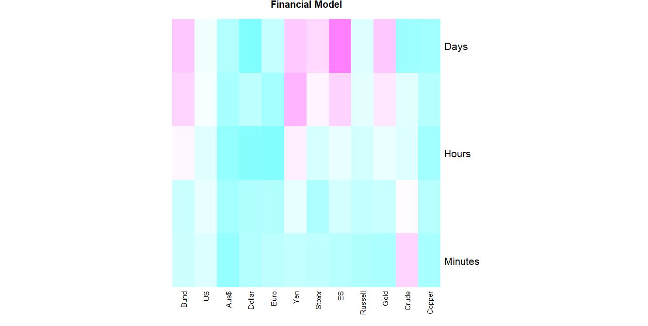
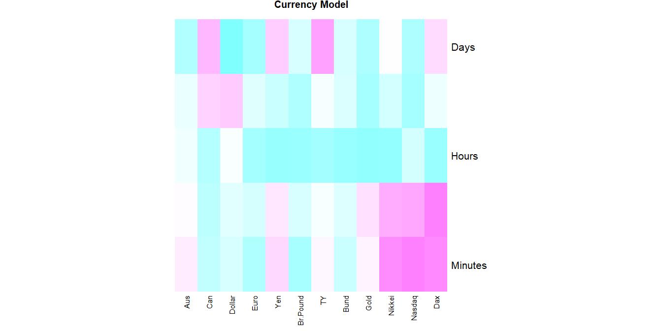
Market Stress
Red shows markets under increasing stress (reversal likely). Blue no stress.
The more markets that are red, the higher the likelihood of a risk event (correlation/trending)
Think of the columns as risk thermometers and the rows as correlation indicators.
Financial Model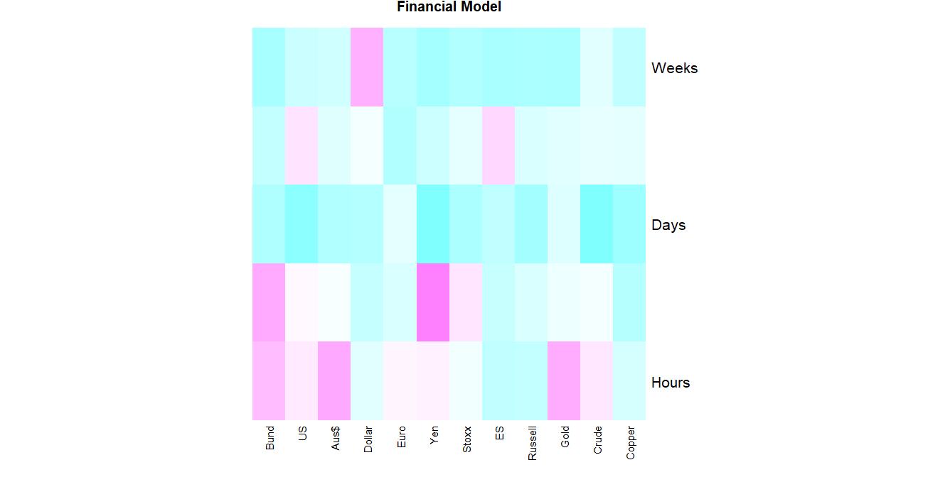
|
Currency Model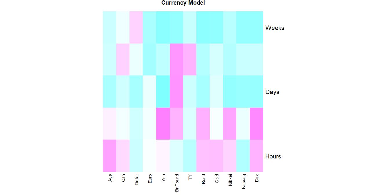
|
Energy Model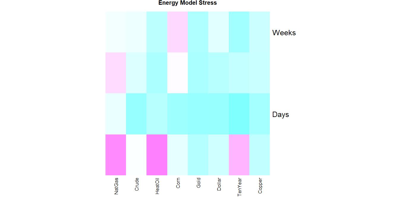
|
|
|
Live tables updated every 10 minutes